The oil and gas industry has everything to gain from high-quality structural maps and this article from Dr. Francis Richards aims to tell you just how to generate the best structural maps.
Accurate fault mapping is vital for understanding reservoirs.
First things first: what is a structural map? In this article it relates to a deformed geological horizon, the mapping of which involves the interpretation of faults.
Faulted horizons, such as the top of a reservoir interval, form the framework upon which exploration, appraisal and development initiatives are based.
The quality of such maps impacts directly on our ability to make sound judgements on the size and geometry of a hydrocarbon trap and how any reserves may be distributed between compartments.
Such decisions are vital to the success of E&P companies.
How To Tell If Your Structural Map is Good or Bad?
So how can you tell if your map is good, bad or indifferent? Basically, a map is only as good as the data used to construct it. The better the seismic used to define horizons and the faults that displace them, the better the map. Thus, a QC of the seismic data is effectively a QC of the final product derived from it. There is an undeniable logic to this statement and it is consistent with the almost universal practice of investing significant time and money in upgrading the quality of the seismic used to generate structural maps.
Interpreting Structural Maps
However, I believe that analysis should not finish with the map but start with it. It is important to test the validity of a faulted horizon map, particularly one based on 2D data or 3D data with quality issues, where the results are contingent on ‘interpretational leaps’ taken in order to complete the map. These decisions are made by humans with different backgrounds, experiences, goals and personalities and lead to contrasting results. Time constraints and company process can also have a significant impact on the products of an interpretation.
Interpretational Freedom
Although research into the interpretation process is relatively limited, the results so far should concern businesses dependent on the outcomes. Bond et al. (2007) documented the variation associated with numerous attempts to interpret a single synthetic seismic line based on an inverted normal fault, demonstrating that, given interpretational freedom, individuals working with the same data see different things and are capable of producing an extremely varied set of results with a significant personal bias.
Interpretational Variation
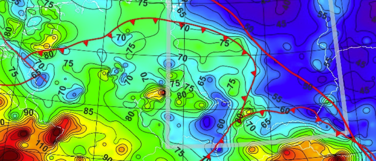
The production of a map obviously involves more than a single line; could this variation extend to the final 3D product – for example, a field-defining structural map? Again, there is relatively little research on this, but some insights were highlighted by Richards et al. (2016), who compared the results of multiple attempts to generate prospects by mapping out a reservoir using an identical 2D data set. The seismic quality was good and the faults affecting the reservoir comparatively simple; surely this would represent a good scenario for some consensus in the final product? The results showed quite the opposite, particularly when the trapped area derived from each map was compared. The number and respective size of the structural traps identified by each map, from a commercial perspective, was in some cases alarmingly variable (Figure 1).
Interpretational Conclusions
On average, eight traps were identified by each team, with six of the eight maps pretty close to the mean trap population size. Two maps stand out as being anomalous: Map 6 with 15 traps and Map 8 with only four. The relationship between the number of traps and the total trapped area is not simple, since the map with the smallest trapped area (4) identified eight traps, while Map 6 with the highest trap count did not generate a significantly higher area.
Sources of Variation
The principal source of the variation could be traced back to how the faults were generated by linking individual fault cuts on each line to form a continuous fault trace. Areas where the density of fault cuts was particularly high effectively offered choice, so interpreters were able to define different fault trends and linkages.
Fault Displacement Analysis
Structural QC involves assessing the validity of a map by bringing to bear mechanical, geometrical and kinematic constraints. There are no hard and fast rules, and whilst specialist software can be extremely useful, it does not guarantee a rigorous analysis. Significant insights can be gained by making basic structural observations and simple measurements, and fault population statistics can also be used to good effect (Freeman et al., 2010).
Three short case studies are described below, with maps taken from relinquishment documents held by the UK Oil and Gas Regulator (OGA) and submitted by operators exiting blocks in the UK North Sea. Basic displacement analysis is applied to a major fault on each map and all three cases highlight a potential structural problem.
What is Fault Displacement?
Displacement measures the finite movement along a fault – see Figure 2, which also indicates how this measurement can be estimated from foot-wall and hanging-wall contour intersections. Measurements made at regular intervals along the fault are easy to display graphically and provide a relatively simple summary of how the fault behaves along its length.
Case Study 1
Figure 3: (a) Top reservoir map from a UK North Sea relinquished block report. (b) displacement calculated along fault A-A’. (This map was generated before the acquisition of new 3D data and may not reflect current understanding. No updated map of the same scale was shown in the report). Photo credit: UK Oil and Gas Regulator Relinquishment Report P2073, 2016.
This top reservoir map (Figure 3) displays three sub-parallel normal faults dipping north-east. A graph of displacement generated for the central fault A-A’ shows displacement increasing quickly from A to 400m but then dropping to zero before returning rapidly to a maximum of 500m. The point of zero displacement is clear on the map, located where the 5,000m contour passes straight through the fault without being deflected (by definition the horizon is not faulted at this point).
Does the zero-displacement zone represent a place where the one mapped fault should be split up into two?
This, however, is structurally problematic as it occurs where displacement from both sides is increasing and apparently approaching its maximum. For this reason, it is more likely the analysis has identified an interpretation error. The recommendation would be to check the seismic data and review the interpretation around this location.
Case Study 2
Figure 4: (a) Top reservoir map derived from a UK North Sea relinquished block report. (b) displacement calculated along fault A-A’. Image credit: UK Oil and Gas Regulator Relinquishment Report P2073, 2016.
Here the structure is slightly more complicated, with two sets of normal faults intersecting at approximately 90° (Figure 4). Again, a displacement graph has been generated for one of the principal faults (A to A’). From A’ the displacement increases slightly but then drops around point 7, probably associated with the intersection of two orthogonal faults observed on the map. Tracing the fault further south-west, the displacement drops to zero and then becomes negative, i.e. an apparent thrust fault. Could this be a result of structural inversion? An alternative is that the polarity of the fault has flipped and that separate faults with opposing dips have been incorrectly joined together. From the map, it is difficult to argue which of the two alternatives is correct.
Regional knowledge could be employed, but at this point the geoscientist would ideally go back to the seismic interpretation to find a solution. Observations like this, when iteratively integrated into the interpretation process, can be an invaluable aid to producing better quality structural maps that best honour the data but are also structurally realistic.
Case Study 3
Figure 5: Top reservoir map derived from a UK North Sea relinquished block report. Credit: UK Oil and Gas Regulator Relinquishment Report P2073, 2016.
In the final example (Figure 5) a different analytical style has been adopted. The width of the displayed faults can be seen to vary along strike, reflecting the estimated displacement along particular sections of the faults; the thicker the fault, the greater the calculated displacement. This approach was adopted as the quality of the map meant it was difficult to accurately read off contour depths over much of the map. The displacements were roughly estimated using colour variation on the original map and are only approximate. Although some caution is required using a map generated in this manner, it actually shows up some potential structural problems.
Faults A, B and C show maximum displacements at their north-east tips. Displacement patterns like this are very unlikely as the strain gradient at the tip zones would be extremely high and would only form where faults are interacting with other faults or some other geological feature. It is probable that the interpreter has truncated these faults and that they extend much further north-east. It is also possible that this has been caused by limitations in data coverage, in which case, even without seismic data, it would make structural sense to extend these faults rather than cut them short as currently mapped.
Working With Poor Quality Source Data
When faced with less than perfect data or data with significant gaps, interpretational decisions need to be made in order to complete the mapping of faulted surfaces. Under such conditions the results from one interpreter to another can vary significantly and the economic implications may be considerable. A timely structural QC of the interpretation has the potential to identify possible errors and help provide a valid structural solution. The short case studies here show how simple displacement analysis can be used to great effect to scrutinise faults.
There are many other types of analysis that can be equally effective, such as;
assessing the geometrical implications of fault shapes,
undertaking strain analysis,
geomechanical analysis,
or looking at fault population statistics.
The trick is choosing the most effective and appropriate analysis for a given interpretation, taking into account the structural setting, size of area under investigation, degree of structural complexity and, importantly, the amount of time available. It is also essential that the QC is undertaken while there is still time to integrate the results back into the interpretation.
After analysing the maps discussed above, one is left wondering how much impact a complete analysis would have had on the assessment of the relinquished acreage. After all, structural maps not only define the size, shape and internal compartments of structural traps, they often play a large part in how we perceive the distribution of sediments and how fluids migrate through the subsurface. The analyses indicate that despite the relinquishments by previous operators, there is the potential to look again at many areas of the North Sea, reinterpret prospectivity in the light of new data and more rigorous structural techniques, and create new E&P opportunities.
Acknowledgements
I would like to thank Nick Richardson (OGA) for taking time to review this article and for his advice and suggestions.
References:
Bond, CE., Gibbs, AD., Shipton, ZK. & Jones, S. (2007). ‘What do you think this is?: “Conceptual uncertainty” In geoscience interpretation’. GSA Today, vol 17, no. 11, pp. 4-10.
Freeman, B., Boult, P. J., Yielding, G. and Menpes, S. (2010). Using empirical geological rules to reduce structural uncertainty in seismic interpretation of faults. Journal of Structural Geology, 32(11), 1668-1676.
Richards, F.L., Richardson, N.J., Bond C.E. and Cowgill, S.M. (2016) Interpretational Uncertainty of Structural Traps; Implications for Risk and Volume Assessment
Geological Society, London, Special Publications, 421, 7-27. https://doi.org/10.1144/SP421.13
UK Oil and Gas Regulator Relinquishment Report P2073. (2016) https://itportal.decc.gov.uk/web_files/relinqs/P2073.pdf
UK Oil and Gas Regulator Relinquishment Report P2024. (2016) https://itportal.ogauthority.co.uk/web_files/relinqs/P2024.pdf
UK Oil and Gas Regulator Relinquishment Report P2055. (2016) https://itportal.ogauthority.co.uk/web_files/relinqs/P2055.pdf